This is absolutely my favorite question, because it intersects so many fields of study! Color means something different to people doing physics, chemistry, biology, mathematics, engineering, psychology, linguistics, or art.
Physics
Color is a property of light. Different colors are different frequencies of light across the visible spectrum.
Electromagnetic radiation spectrumby Philip Ronan licensed under CC BY-SA 2.5 / added dark theme support
For example, light with a wavelength of
Mixed light is rarely made up of just a couple wavelengths. Physicists generally talk about the spectral power distribution (SPD) of light, which measures for every wavelength the amount of power carried at that wavelength. Notably, hot objects around 2200°F (1500K) start to glow red, but not just at
Chemistry
Color is a property of pigments. Different pigments absorb different amounts of each frequency of light.
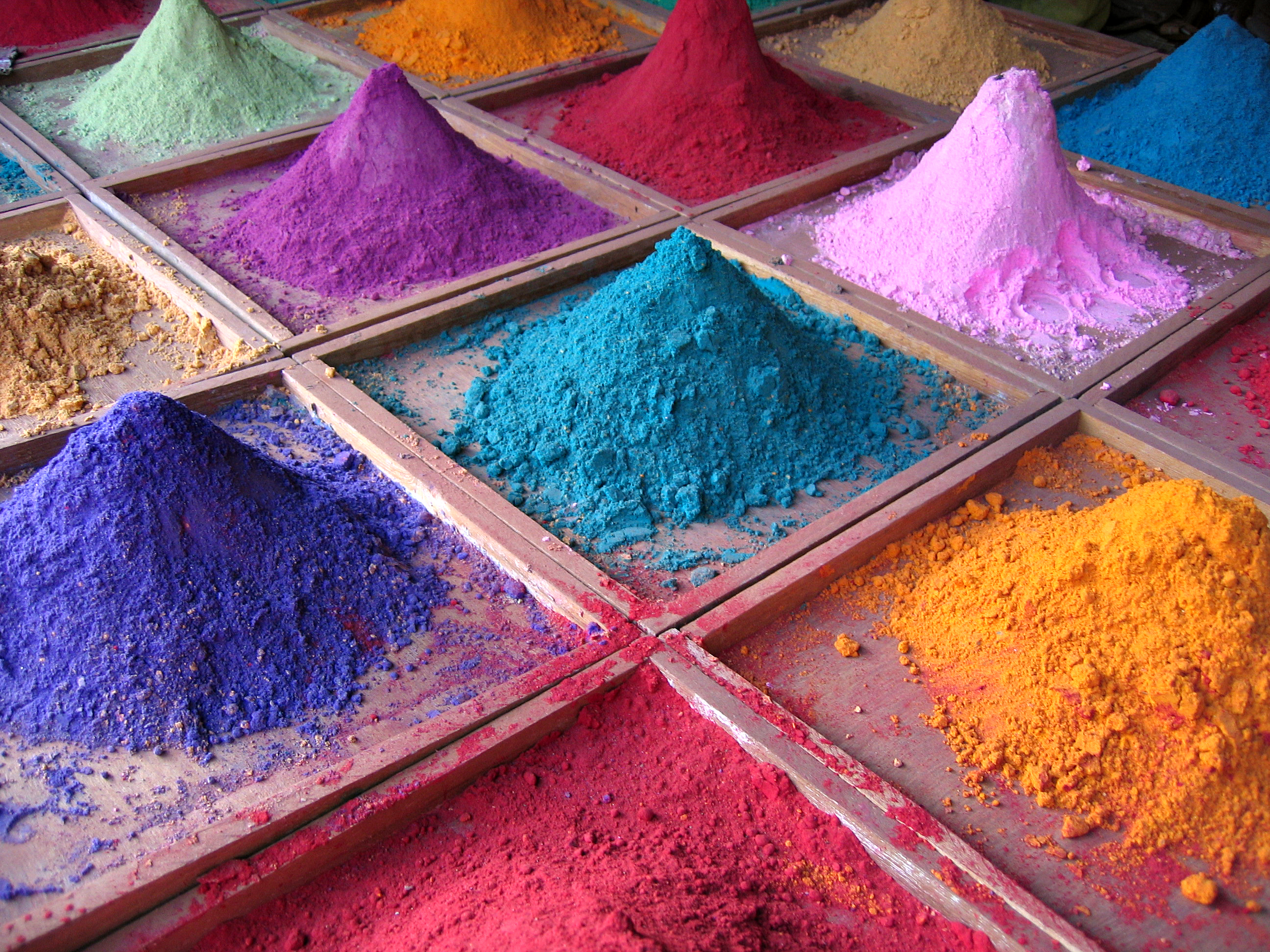
Indian pigmentsby Dan Brady licensed under CC BY 2.0
There are many more colors of pigment than colors of light. A blue pigment is one that reflects mostly
When mixing pigments together, the absorption spectra combine. To get a
Biology
Color is the stimulation of cone cells. There are three different colors of cone.
1416 Color Sensitivityby Francois~frwiki licensed under CC BY-SA 4.0 / added dark theme support
Because you only have three types of cone cells, some combinations of light will look the same. In physics terms, pure
We abuse the biology of vision to make screens work. A real rainbow emits all the frequencies of visible light, but a picture of a rainbow only eimits blue-ish, green-ish, and red-ish frequencies. You can’t tell the difference.
Biology is also why the violet end of the spectrum looks purplish. As already mentioned, our red cones are mostly sensitive to long wavelengths around
There are all sorts of interesting things you can learn about color vision. Some of my favorites are:
- In low light conditions, our rod cells contribute more to our vision, completely changing how we perceive color.
- Many people only have two functioning colors of cone cell. Depending on which cells are functioning, they might experience
orange andgreen as nearly the same color (because they activate the same functioning cones) orblue andred as nearly the same color. - A few women have an additional functioning cone cell, allowing them to decern combinations of wavelengths which would appear to the rest of us as exactly the same.
- All humans have an additional cell in our eyes which is sensitive to some other
bluish wavelengths, but we can’t consciously perceive the effect. It only helps to synchronize the circadian rhythm. - Animals have entirely different sets of cone cells. Many insects can see into the
ultraviolet wavelengths, while reptiles can see into theinfrared . Birds often have 5-7 different cone cells, allowing them to decern all sorts of combinations we can’t. Famously, mantis shrimp have 12 different cone cells, but their brains can’t really use all that information. - Your red cones are much more sensitive to light at
560nm than the650nm wavelengths we think of as red. This is one reason the cones are properly called “long”, “medium”, and “short”. Your perception of green comes not from green-sensitive cones directly, but from ganglion cells behind the cones that subtract the long wavelength stimulus from the medium wavelength stimulus. - By overstimulating some of your cone cells and then looking elsewhere you can cause an “impossible” stimulus, one that no physical light could trigger on its own.
Mathematics
Color is a 3-dimensional vector space.
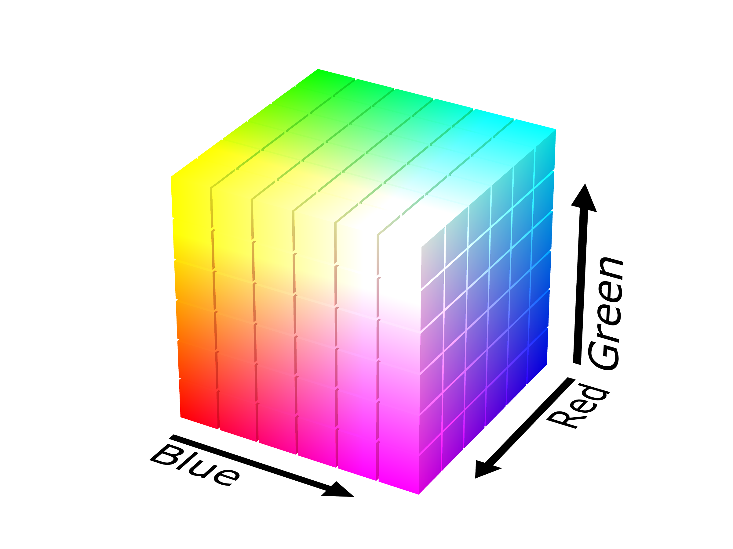
RGB color solid cubeby SharkD licensed under CC BY-SA 4.0
Since humans only have three cone cells, all the different wavelengths in a color can be summarized with three different numbers. The amount that color activates our red cones, green cones (really ganglion cells), and blue cones! White is
TODO: these paragraphs have a lot of AI-written sentences remaining, rewrite
While RGB is intuitive and directly related to how our eyes work, it’s not the only way to represent colors mathematically. Think of color as a point in a three-dimensional space. RGB uses one axis each for red, green, and blue, but we can rotate or transform this space to create new coordinate systems, each with its own advantages. For example, we could flip the axes to create BGR, where red becomes
The HSL (Hue, Saturation, Lightness) color space reorganizes our color point using polar coordinates. Instead of XYZ axes, we use an angle around a color wheel for hue, a distance from the center for saturation, and a height for lightness. In this system, red might be represented as
Each of these ‘color spaces’ is just a different way of specifying the same colors, like describing a location using latitude and longitude versus street addresses. They’re interchangeable, but some are more useful than others depending on the task at hand. Computer generated imagery (CGI) tends to use RGB because it best represents the physics being simulated. But when encoding a video we usually convert to YCbCr color space because it helps compress the differences in color that humans won’t notice. If you need someone to pick a color, HSL is useful because it organizes everything into a color wheel. But HSL doesn’t quite match the biology of vision. For example, putting HSL’s
Engineering
Color is a signal sent to a display or received from a sensor.
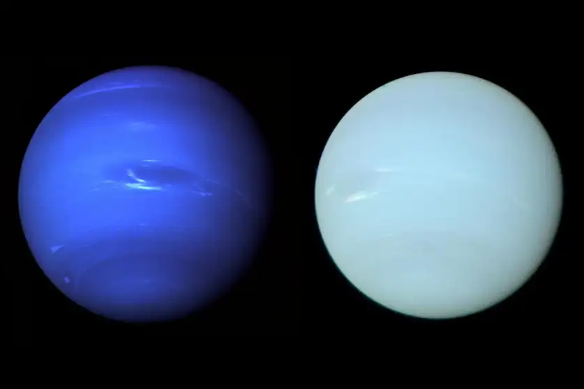
Modelling the seasonal cycle of Uranus’s colour and magnitude, and comparison with Neptune, Figure 8by Patrick G J Irwin et al.
Did you know that up until recently we did not know neptune’s color? It was generally depicted as a
It is an oft-repeated fact that NASA’s cameras are black & white, but this isn’t quite true. The magnetic deflection vidicon used as a camera on the Voyager missions couldn’t tell frequencies apart by itself (for that it used a spectrometer). But there were ten different color filters Voyager could place in front of the vidicon to limit it to specific frequencies, including frequencies associated with methane and sodium. The Voyager spacecraft were built to do science, not take pretty pictures.
In fact, the modern CMOS camera is also incapable of distinguishing different frequencies. Like Voyager, color filters are applied. But unlike Voyager, which could place any of the ten color filters in front of its camera, each pixel in your camera has a single pigment permanently glued to the front of it. You get RGB by alternating red, green, and blue pixels. Then some software makes up each of the two missing colors based on each pixel’s neighbors. This makes life famously difficult for people doing green screen work.
Although Voyager’s red, green, blue color filters were not calibrated to match the sensitivity of a human’s cone cells, the magnetic deflection was calibrated to accurately measure light brightness. Unfortunately, the computer monitors on earth weren’t. If the vidicon measured twice as much blue vs red, NASA’s computers would simply double the power of the electron beam illuminating the blue phosphors in each CRT monitor. That increases the actual blue light output of the monitor by roughly 430%, so the image would look far too blue. NASA isn’t stupid, but they were more interested in seeing the detail in Neptune’s clouds than in perfect color reproduction. In some cases they even amplified the effect! For a photograph to look correct on a CRT monitor, the colors need to be gamma corrected, so that “twice as bright” translates to only 137% as much power. Even now when CRTs are long gone, the sRGB color space used by this (and every other website) expects gamma corrected colors. And to this day, lazy programers still screw it up.
CIE1931xy gamut comparison of sRGB P3 Rec2020by Myndex licensed under CC BY-SA 4.0 / added dark theme support, optimized
And that isn’t the end of it. We can all agree (for example) that in sRGB color space
Of course, screens got better and monitors today can display quite extreme greens. Alas, most software is limited to the sRGB gamut: all the colors that can be made by mixing the most red, most green, and most blue values in the sRGB color space (called the primaries). The P3 and Rec2020 color spaces have much wider gamuts, but at the time I’m writing this they aren’t widely adopted.
Psychology
Color is your brain guessing what pigments are in a thing.
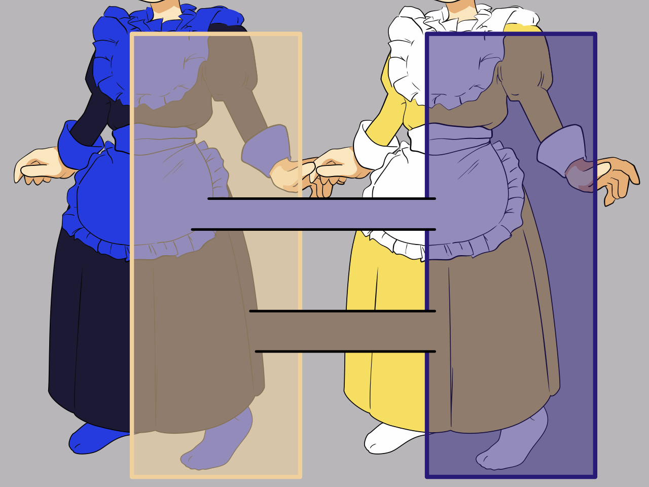
Wikipe-tan wearing The Dressby Kasuga~jawiki licensed under CC BY-SA 3.0
Subconscious pigmentation solving is obvious in the dress picture above. Based on context, you correctly see the pigmentation of the apron on the left as
Evolution doesn’t care if you appreciate the beautiful blue of the noon sky, it only cares if that bush is a delicious wild blueberry or poisonous baneberry. Short of putting it in your mouth, how can you tell? By the pigments of course! The baneberry has few pigments, mostly reflecting whatever light hits it (that is, it is
So instead of taking light at face value, your brain subconsciously solves for the pigmentation of every object you see, taking into account the context you are seeing it in. Does the snow next to that blueberry also look blue? Then the light must be blue and the berry is white. Are the clouds flaming red? Then everything orangy is actually white, and blue things are very blue.
I’ve spend most of PhD research trying to get computers to separate pigmentation and lighting the way humans do without even noticing. It is insanely difficult. For a while, researchers needed humans to manually rank the lightness of points so they could train matching computer systems. Brains are so cool 🧠.
Our built-in automatic pigmentation solving is a pain for people trying to display images on screens. Assuming you aren’t using an e-ink display, all the
Linguistics
Colors are words.
TODO: the first paragraph still has AI-sourced sentences, rewrite
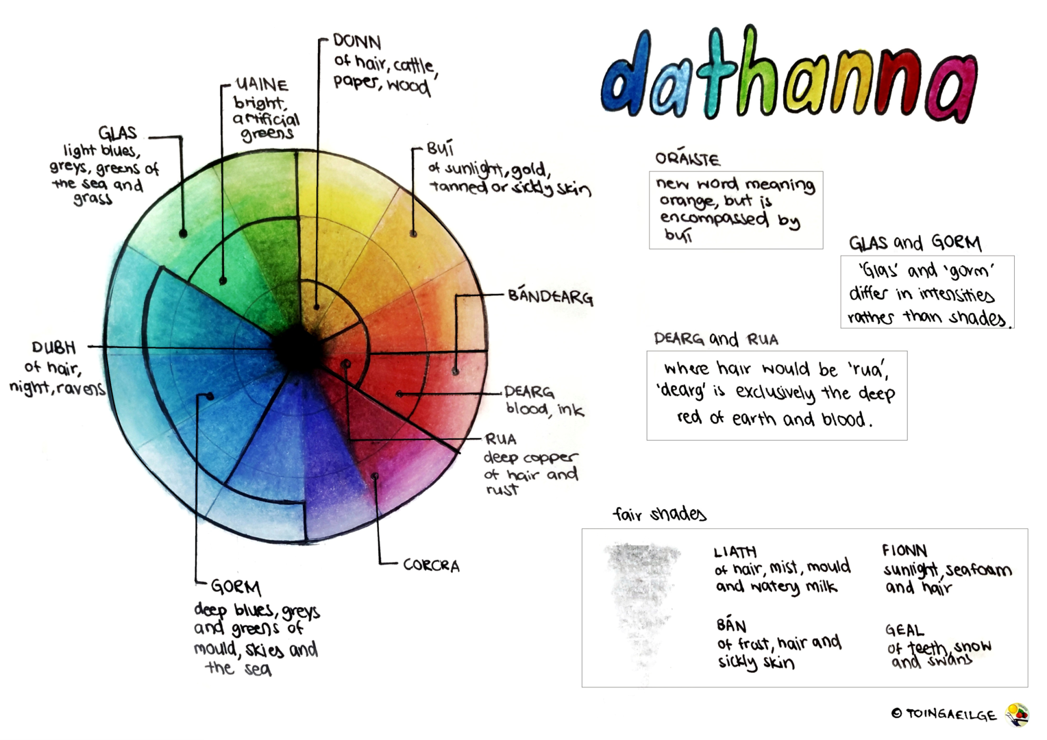
Colors in Irishby Sherlyn licensed under CC BY-SA 4.0
The way we perceive and categorize colors is deeply influenced by the language we speak. Different cultures and languages divide the color spectrum in unique ways. For instance, the distinction between blue and green is not universal. In many languages, including Vietnamese, Korean, and some African languages, a single word encompasses both blue and green. This linguistic phenomenon, known as “grue”, challenges our assumption that these colors are fundamentally distinct. Speakers can still distinguish between colors with modifiers and less basic words (e.g.
On the other hand, some languages (like Russian or Irish) have separate basic terms for
The evolution of color terms in languages is thought to follow a relatively consistent pattern, set out in a 1969 book “Basic Color Terms: Their Universality and Evolution”. Many languages start with terms for
Art
Colors convey ideas.
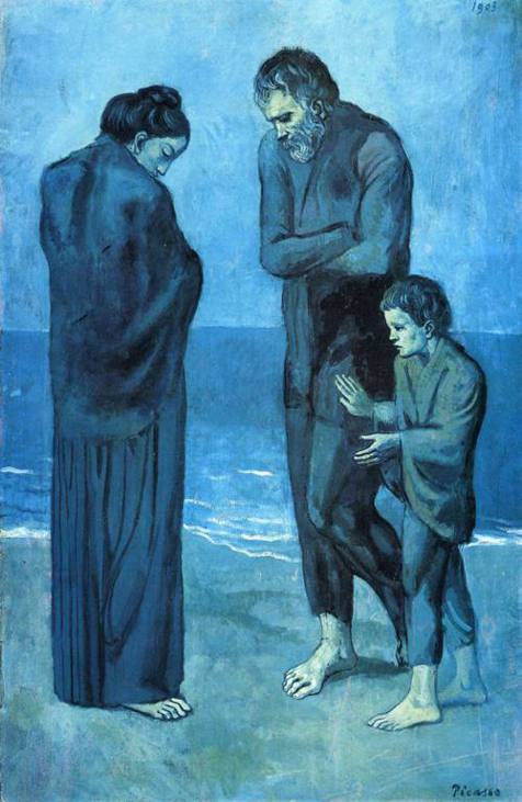
The Tragedyby Pablo Picasso
TODO: this got spat out of an AI, completely rewrite
In the realm of art, color transcends its physical properties, becoming a powerful tool for expression, emotion, and communication. Artists manipulate color in ways that challenge our perception and evoke complex responses, often blurring the lines between the scientific, psychological, and cultural aspects of color.
Consider Pablo Picasso’s “The Tragedy,” a masterpiece from his Blue Period. The predominant use of blue hues creates a somber, melancholic atmosphere that resonates with the painting’s theme. This exemplifies how artists can use color to convey emotional states and ideas beyond the literal representation of a scene.
The journey of color from reality to art to viewer is a fascinating process of translation and interpretation:
- In the real world, objects and people reflect light based on their inherent pigments and the ambient illumination.
- An artist, however, doesn’t simply replicate these colors. They interpret and translate them, often using unconventional colors to represent shadows, highlights, or reflections.
- The painting, when displayed in a museum, is typically lit neutrally, allowing the artist’s color choices to be viewed as intended.
- As a viewer, your brain doesn’t process the pigments of the paint itself. Instead, it attempts to reconstruct the scene or idea the artist aimed to convey.
- If you’re viewing a digital reproduction of the artwork, the process becomes even more complex. The camera captures the painting’s colors and converts them into sRGB-encoded values.
- These values then control the light emitted by your computer screen or mobile device.
- Finally, your brain interprets this emitted light, solving backwards through multiple layers of translation: the artist’s interpretation, the illumination of the artwork, and the light from your display.
This multi-layered process of translation allows artists to play with color in ways that transcend literal representation. They can use color symbolically, emotionally, or abstractly to convey ideas and evoke responses.
Colors in art can have profound psychological effects. For example:
- Red often symbolizes passion, danger, or excitement.
- Blue can evoke calmness or melancholy.
- Yellow might represent joy or caution.
- Green often signifies nature, growth, or envy.
However, these associations can vary across cultures and contexts. Artists leverage and sometimes subvert these color associations to create complex, nuanced works that speak to viewers on multiple levels.
In contemporary art, color theory has evolved beyond traditional uses. Artists like Mark Rothko used large color fields to create immersive emotional experiences, while others like Yayoi Kusama use vibrant, repetitive color patterns to explore concepts of infinity and perception.
Ultimately, in the hands of an artist, color becomes more than just a visual property. It’s a language of its own, capable of expressing the ineffable, challenging perceptions, and bridging the gap between the visible world and our inner experiences.